GUI
The GUI module introduces a series of game object components to ease the setup of interactions between the player and the game whether that interaction happens on the screen/HUD or anywhere in the 3D world.
Each of the components may be added via script with gameObject:AddComponent( "ComponentType" [, params] ), or in the scene editor via the corresponding scripted behavior.
All events fired at the components pass along the component instance as first and only argument.
The components with which you can interact with the mouse have the guiComponent tag. Be sure this tag is added to the tags property of the Mouse Input scripted behavior that you added to your camera game object (see below).
Working with pixels and cameras
The Hud component lets you position the game object "on screen", using pixels coordinates.
Several of the other components also allows you set some value expressed in pixels instead of scene units.
The relation between scene units and pixels depends on the camera component that renders the object.
That's why those components must kept a reference to the camera game object they are rendered by.
This can be done simply by making the game object (with the GUI component) a child of the camera game object.
You can also set the camera game object as the value of the cameraGO property in the component's parameters when you create it (or the camera game object's name as the value of the cameraName property of the component's scripted behavior).
This relation is mandatory for Hud, Slider and Input components, and required for ProgressBar and TextArea component only if you set a value expressed in pixel.
Hud
The Hud component lets you position the game object "on screen", using screen coordinates (yet it remains a 3D element in the scene).
As said in the "Working with pixels and cameras" paragraph, the game object hosting a hud component must
- be a child of a game object with a camera component, or
- have a game object with a camera component set as the value of a
cameraGOproperty in the component's properties when creating the component
Ie (when the hud game object isn't a child of a camera):
self.gameObject:AddComponent( "Hud", {
    position = Vector2.New(0),
    cameraGO = GameObject.Get("Player Camera")
} )

self.gameObject:Set( {
    hud = {
        position = Vector2.New(0),
        cameraGO = GameObject.Get("Player Camera")
    }
} )
Position
You can position a game object on screen using hud:SetPosition(position) or hud:SetLocalPosition(position) and get the position via the corresponding getter. The expected position argument is a Vector2 (like Vector3, but with only the x and y components).
The global position is relative to the HUD origin, while the local position is relative to the game object's parent (if any).
local go1 = GameObject.New( "go1", { hud = {} } )
local go2 = GameObject.New( "go2", { parent = go1, hud = {} } )

go1.hud.position = Vector2.New( 20, 10 )
go2.hud.localPosition = Vector2.New( 20, 10 )
-- go2 has a global position of {40, 20}

local go3 = GameObject.New( "go3", {
    hud = { position = Vector2.New( 40, 20 ) }
} )
-- go2 and go3 are at the same position
The position can be expressed :
- in pixels, as a number or a string suffixed by
"px"(note that all other components consider numbers as scene units) - in scene unit, as a string suffixed by
"u" - in percentage of the screen side's size, as a string suffixed by
"%". Ie :Vector2.New( "50%", "50%" )represents the center of the screen. - relative to the screen side's size, represented by
"s". Ie :"s-50"means "screen size minus 50 pixels" (which makes 400 pixels for a 450 pixels wide and hight screen).Vector2.New( "s-100" )is a point at 100 pixels from the right and bottom sides of the screen.
Layer
The layer is a number that describe in which plan the game object is positioned. The sign and value of the layer tells if the game object is behind or in front (and how far) of its reference.
All game objects that are visible from the camera have a positive global layer. A negative global layer effectively puts the game object behind the camera's viewport.
The biggest the global layer, the farther away from the camera the game object is. Note that game objects that are too far away won't be rendered.
A strictly positive local layer (1 or bigger) means that the game object is behind its parent (from the camera's point of view), yet a negative local layer puts the game object in front (closer to the camera) of its parent.
Set the layer via hud:SetLayer(layer) and hud:SetLocalLayer(layer) and get it via the corresponding getter.
Toggle
The Toggle component allows you to create check boxes or radio buttons.
Interaction with the mouse are allowed by the MouseInput component.
When the toggle uses a TextRenderer, it adds some additional (and optional) text (the 'check mark') to the TextRender's text to display the toggle's state. You may set the check mark for both state via the checkedMark and uncheckedMark properties.
Use toggle:GetText() and toggle:SetText(text) to get and set the toggle's text without bothering with the check mark (it will be added/stripped automatically).
When the toggle uses a ModelRenderer, you may set two models (name or asset) via the checkedModel and uncheckedModel properties.
The check mark or the model will automatically be updated when the toggle's state is updated via toggle:Check([state]) which also fires the OnUpdate event. Note that unlike all other optional boolean arguments, the default state is true.
Get the state via the isChecked property.
gameObject:AddComponent( "Toggle", {
    checkedMark = "√ :text" -- ':text' represents the toggle's text, the rest is the check mark
    uncheckedMark = ":text: Nope!"
    -- if the toggle has "Mute sound" as its text, "√ Mute sound" is displayed when the state is true (checked)
    -- and "Mute sound: Nope!" is displayed when the state is false (unchecked)
} )

function gameObject.toggle.OnUpdate( toggle ) -- this function "catches" the OnUpdate event
    local state = "checked"
    if toggle.isChecked == false then
        state = "unchecked"
    end
    print( "The Toggle component on the game object of name '"..toggle.gameObject.name.."' is now "..state )
end

gameObject.toggle:Check( false )
-- will print "The Toggle component on the game object of name 'Toggle' is now unchecked"

gameObject.toggle:Check() -- or toggle:Check( true )
-- will print "The Toggle component on the game object of name 'Toggle' is now checked"
Toggles as radio buttons
You may put several toggles inside a same group to use them as radio buttons. Only one toggle in the group will be checked at a time.
Set the group name via the group property. It adds the eponym tag to the toggles, so you may get them all via GameObject.GetWithTag([groupName]).
ProgressBar
The ProgressBar component scales the game object to reflect the progress of a numerical parameter between a minimum and a maximum value.
gameObject:AddComponent( "ProgressBar" )
gameObject.progressBar:Set( {
    minValue = 0,
    maxValue = 500,

    minLength = 0,
    maxLength = "250px", -- 250 pixels

    height = 0.5, -- 0.5 units
} )

gameObject.progressBar.value = 100 -- makes the bar 1/5 of its maximum length (50 pixels long)
gameObject.progressBar.value = "90%" -- makes the bar 90% toward its maximum length from its minimum length (225 pixels long)
The minValue and maxValue properties set the boundaries of the parameter.
The value property tells how far the parameter currently is toward maxValue. It can be an absolute value (between minValue and maxValue) or a percentage (as a string suffixed with "%", between "0%" and "100%").
The progressBar:SetValue() function sends the OnUpdate event. You may also use the progressBar:UpdateValue(progress, fireEvent) for better performances, see paragraph below.
The minLength and maxLength properties set the min and max size of the bar. The bar's size is equal to minLength when value is equal to minValue or "0%" and equal to maxLength when value is equal to maxValue or "100%".
The height property (or Setheight()) sets the height of the bar.
With these three properties, the size may be expressed as a number in scene units or in pixels as a string suffixed with "px".
If you set one of these value as a string, they will be converted to number (and in scene units) the next time SetValue() is called.
Yet the component only changes the game object's local scale, the bar is best rendered by a model that you have to add yourself.
The direction the bar progress to (to the right, to the left or anything in-between) depends on how the model is created. The model should be a single block with a block size of 16 in every directions.
At a position of {0, 0, 0} in the model editor, the origin of the progress bar is the center of the model, so the bar will scale to the right and to the left of its origin.
Setting a position of {-8, 0, 0} puts the origin of the model to its right side, making the bar grow to the left of the screen, while a position of {8, 0, 0} will make the bar grow to the right.
Feel free to rotate the game object to get a vertical (or oblique) bar. Note that if the bar is vertical, the min and max length become the actual min and max height and the height become the actual width.
Note on performance
Updating several dozen of progressBar per frame (when used as health bar for multiple game entities, for instance) may significantly slow down the game.
It depends if the debug is enabled and which function you use to update the progress.
progressBar:UpdateValue() is a faster version of progressBar:SetValue() but it does not check for type or value of the arguments.
The table below shows some benchmark.
The first column is the approximate number of progress bars updated per frame at which we begin to notice that the game runs slower than it should (with an otherwise empty project).
| # | Function | Debug |
|---|---|---|
| 35 | SetValue() | Enabled |
| 100 | UpdateValue() | |
| 130 | SetValue() | Disabled |
| 280 | UpdateValue() |
Slider
The slider component lets the user set a value by dragging a handle displayed on the hud with the mouse.
Interaction with the mouse are allowed by the MouseInput component.
As said in the "Working with pixels and cameras" paragraph, the game object hosting a slider component must
- be a child of a game object with a camera component, or
- have a game object with a camera component set as the value of a
cameraGOproperty in the component's properties when creating the component
`
gameObject:AddComponent( "Slider", {
    minValue = 0,
    maxValue = 500,
    length = "100px", -- in pixels
    axis = "x", -- define if the slider is horizontal or vertical

    -- as with progressBar and toggle, the OnUpdate event is fired when the value changes
    OnUpdate = function( slider )
        print( "The slider has now a value of "..slider.value )
    end,

    cameraGO = GameObject.Get("Player Camera"),  -- not necessary when the game obejct is a child of a camera
} )

-- the value may also be set via script, the slider handle will be moved at the corresponding position
gameObject.slider.value = "75%"
The minValue and maxValue properties set the boundaries of the value. The length property sets size of the slider.
The value property is the current slider's value. It can be an absolute value (between minValue and maxValue) or a percentage (as a string suffixed with "%", between "0%" and "100%").
The OnUpdate event is fired when the slider:SetValue() function is called or the handle is dragged.
The game object with the slider component must have a parent but if you didn't created it yourself, it will be created automatically at the slider's current position. The position of the parent is considered as the reference, where value = minValue.
The slider only works when used on the Hud and may only be dragged horizontally or vertically, based on the axis property. Set "x" for horizontal sliders (the start position is on the lef) or "y" for vertical sliders (the start position is on the bottom).
The handle (the thing that is displayed and that the user drags with the mouse) may be a model, a map or a text on the same game object as the component.
Input
The Input component creates a field where users can write text. The game object needs to have a TextRenderer component as well.
Interaction with the mouse are allowed by the MouseInput component.
As said in the "Working with pixels and cameras" paragraph, the game object hosting a hud component must
- be a child of a game object with a camera component, or
- have a game object with a camera component set as the value of a
cameraGOproperty in the component's properties when creating the component
Input fields have a focused state that can be get via the isFocused property and set via the input:Focus() function which fires the OnFocus event.
Input fields only react to user inputs when they are focused. Pressing the left mouse button (over the text or the background) will focus the field the mouse currently hovers (if any) and unfocus any fields that it doesn't hover.
Updating the value via the input:Update() function or by keystroke fires the OnUpdate event.
The OnValidate event is fired when the ValidateInput button is pressed and the field is focused.
The maxLength property allows to limit the number of characters of the input text.
The characterRange property allows to define the range of allowed characters that can be written in the field. Just set the property with a string containing all allowed characters.
The defaultValue property allows to setup a placeholder text.
If the property is set and the input's text is empty when it gets unfocused, the input will be filled with the property's value.
Similarly, the input text gets emptied when it gains focus and the text is the property's value.
The focusOnBackgroundClick property, when true, allows to focus the input when the user clicks over a "Background" game object that has a model renderer and is a child of the input (otherwise, the input happens only when the user clicks on the text).
When the background game object exists, you can access it via input.backgroundGO.
You may also add a cursor to the input simply by having a "Cursor" game object with a model renderer as a child of the input. The cursor will be visible only when the input is focused and will blink at the rate defined by the cursorBlinkInterval property (in second).
The position of the cursor is updated on focus and on each update of the text. The OnUpdate event is fired at the cursor game object, which you can get via input.cursorGO.
Note that the cursor will always be at the end of the input text.
gameObject:AddComponent( "Input", {
    maxLength = 10, -- creates a field with 10 characters at most
    characterRange = "0123456789", -- creates a field where only positive integers are allowed
    defaultValue = 12345,
    OnValidate = function( input )
        DoSomething()
    end,

    cameraGO = GameObject.Get("Player Camera"), -- not necessary when the game obejct is a child of a camera
} )
TeaxtArea
The TextArea component is a flexible and multi-line text renderer.
It features all properties of a text renderer (font, text, alignment and opacity) plus some specific ones :
lineHeight: height of a line in scene units or pixels (as a string suffixed by "px"). This only defines the space between two lines, it does not scale the lines.verticalAlignment: define the vertical positioning of the game object vis-à-vis of the text. Can be"top"(the text is below the game object),"middle"or"bottom".newLine: string used to mark the end of a line (the string is not included in the line).areaWidth: maximum width of a line in scene units or pixels. Must be strictly positivewordWrap: define what happens when a line is longer than the area width:- cut the line and discard the remaining characters when
false - creates one or several new lines with the remaining characters when
true
- cut the line and discard the remaining characters when
All of these properties may be get or set via their corresponding getter and setter.
Note that the area width and line height do not take the scale of the gameObjet into account. They are size as they appear on-screen.
Yet it is not used to render the textArea's text, you can safely add a text renderer to the same game object as the textArea (in order to check for the text's size, for instance).
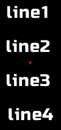
In the examples below, the small red square shows the position of the game object.
| Example | Result |
|---|---|
|
 |
|
 |
|
 |